IndyQuest: Gamified Multi-Modal Exploration for Indianapolis
Reimagining urban wayfinding for IU students, newcomers, and tourists by transforming city exploration into a tangible adventure: combining limestone interactive kiosks, physical stamped postcards, and effortless Google Maps navigation.
Role
Lead UX & UI Designer
Context
Indiana University (IUPUI)
Target Audience
IU Students, Newcomers, Visitors
Core Tools
Figma, Blender 3D, Paper Testing
A city rich in culture, yet difficult to navigate
Indianapolis is full of cultural enclaves, public parks, historic monuments, and independent neighborhood businesses. However, for thousands of new Indiana University students, incoming healthcare professionals, and out-of-state visitors arriving each semester, the city often feels confusing and intimidating to explore.
Unlike dense transit-first metropolises, Indianapolis is sprawling and car-centric. Newcomers quickly retreat into a tiny comfort bubble: sticking only to their immediate apartment block, the Canal Walk, or Massachusetts Avenue. Beyond those corridors lies a vibrant city that remains largely undiscovered because existing tourism tools fail to guide them effectively.
Sterile Directory Fatigue
Standard city guide apps read like dry telephone books, offering endless Yelp-style lists without curated narrative, personal context, or emotional momentum.
Logistical & Safety Friction
First-time visitors constantly worry about parking availability, transit costs, and safety when venturing into unfamiliar urban districts.
Zero Tangible Keepsake
Digital-only check-in apps disappear into screen fatigue. Explorers crave physical memories and shared milestones that honor their real-world journey.
Framing the inquiry: From raw questions to actionable scope
We initiated discovery by synthesizing core user inquiries across university student forums, campus newcomer discussions, and tourist behavior patterns. We mapped the problem space across five foundational pillars: the exact user needs, geographic boundary constraints, discovery mechanisms, multi-modal transit realities, and the tangible purpose of public kiosks.
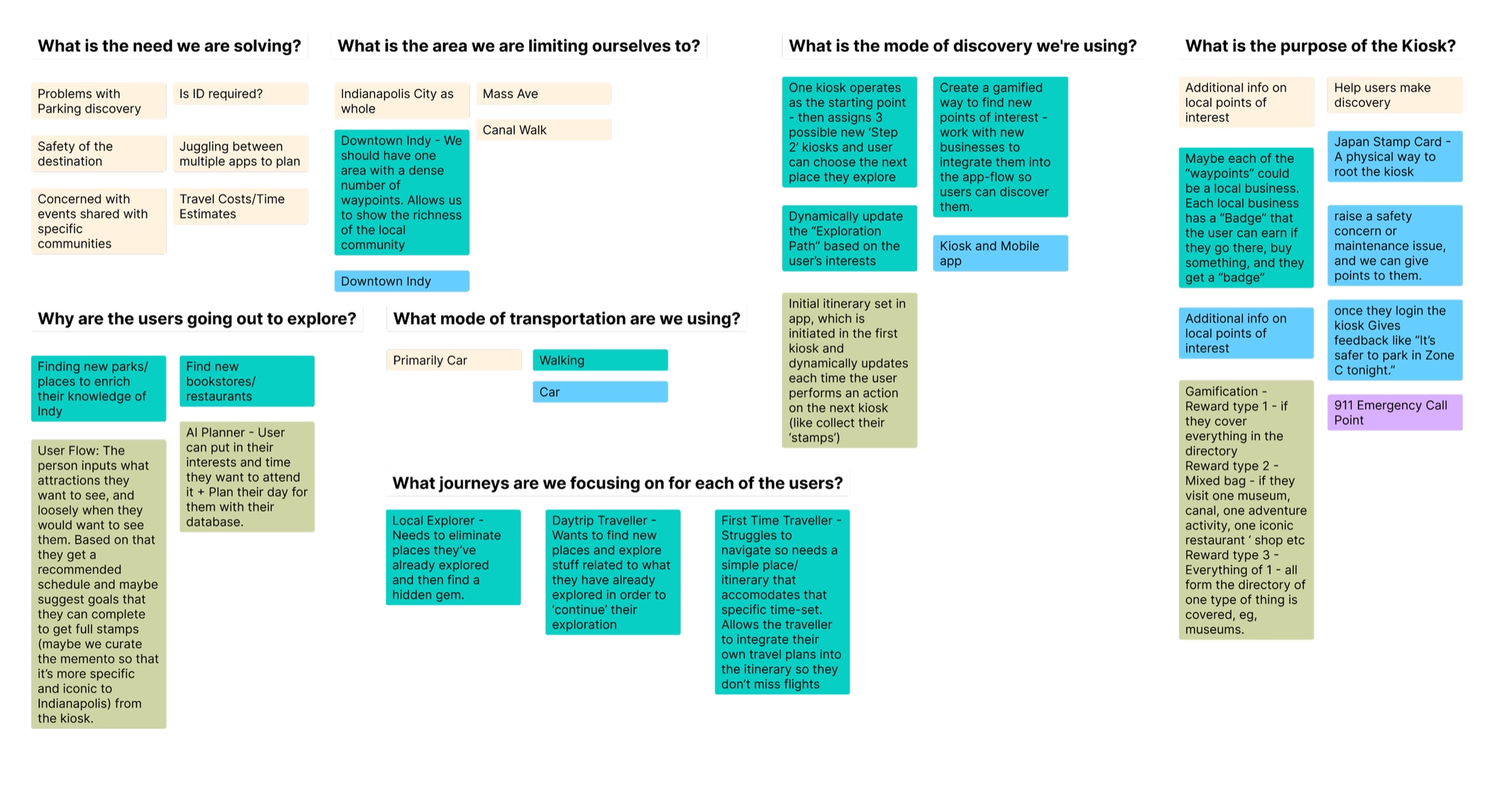
Figure 1: Early research matrix defining target scope, mobility modes, and kiosk touchpoints.
Core Research Takeaways
- • Rooting Discovery in Physical Space: Kiosks serve as anchor beacons that give users reassurance, verified safety information, and physical grounding in the city.
- • Multi-Modal Transit is Non-Negotiable: Indianapolis visitors use a blend of personal cars, rideshares, Pacers bikeshare, and walking. Forcing a walking-only model would severely limit user adoption.
- • Japanese Stamp Rally Inspiration: We drew deep inspiration from Japanese train station stamp rallies (Eki stamps), where physical ink stamps create a collectible, rewarding reason to visit each unique landmark.
Learning from four spatial and gamified exemplars
Rather than building in isolation, we audited four industry exemplars across urban infrastructure, physical fitness, spatial treasure hunting, and location-based gaming to extract proven interaction models.
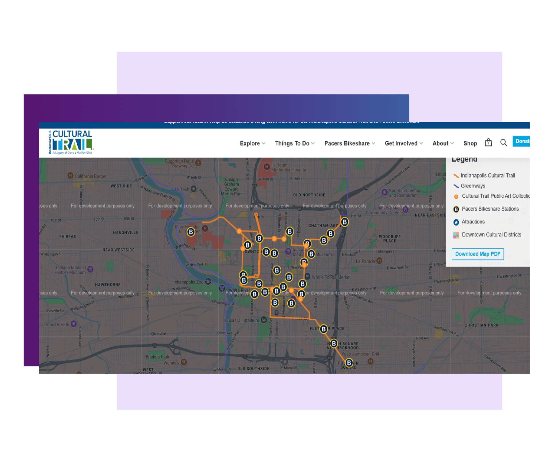
Indy Cultural Trail
Demonstrated how physical, well-lit urban corridors and Pacers Bikeshare stations build civic trust and give pedestrians confident pathways through urban districts.
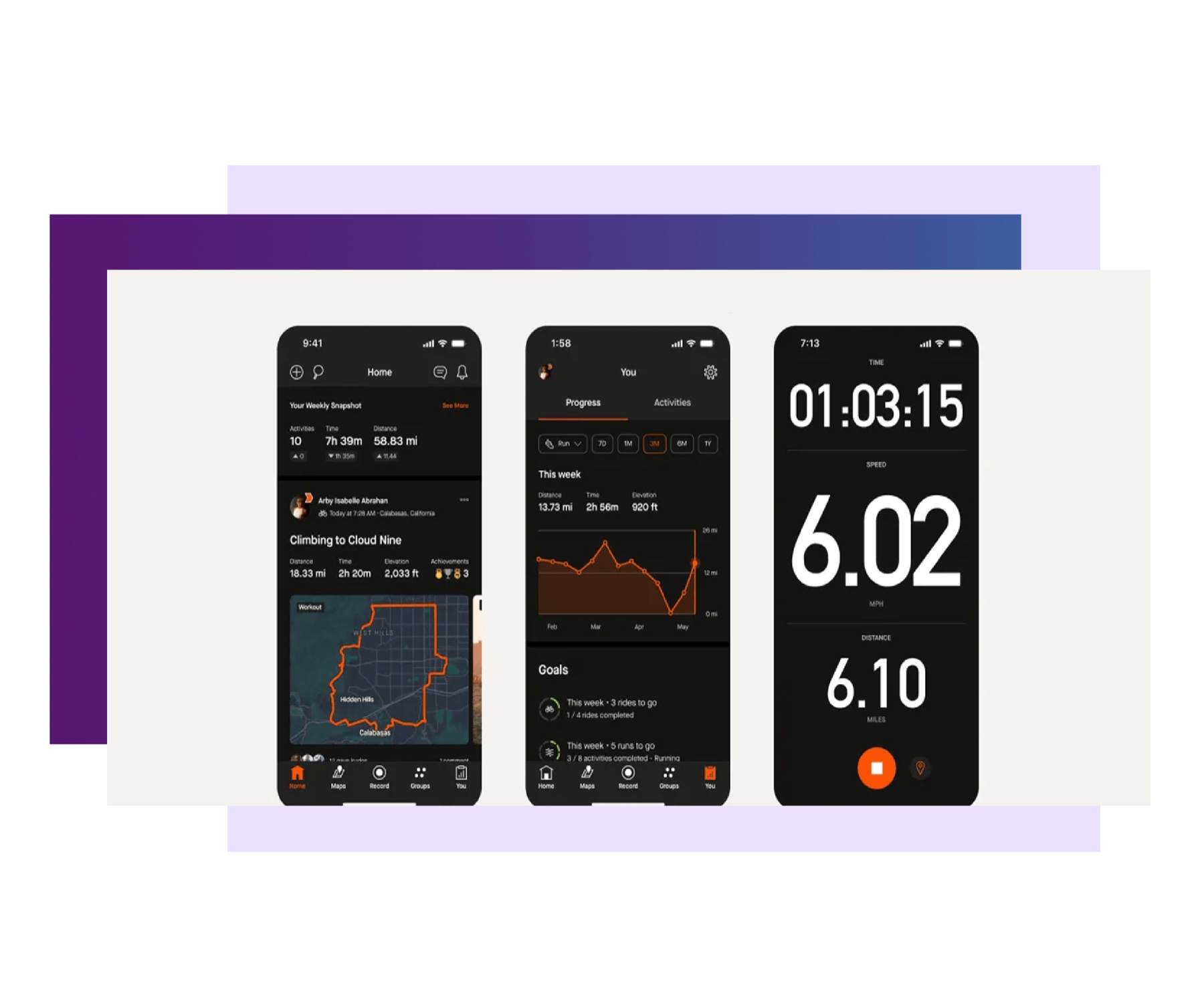
Strava Routes
Showed how personal path tracking, elevation progress, and segment completion transform routine movement into an empowering sense of personal momentum.
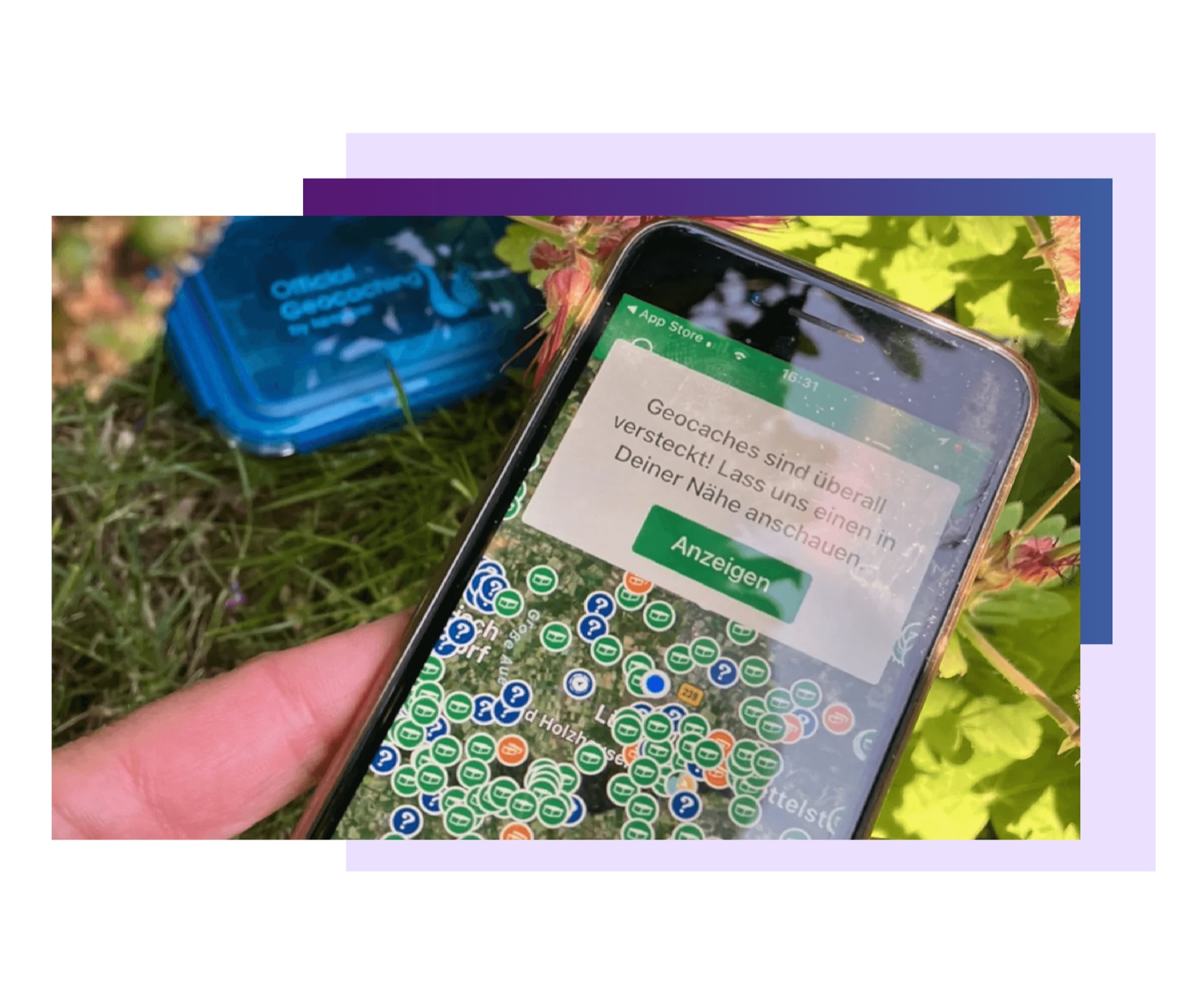
Geocaching
Proved that finding a physical object hidden in the physical landscape creates vastly deeper emotional satisfaction than tapping a digital badge on a screen.
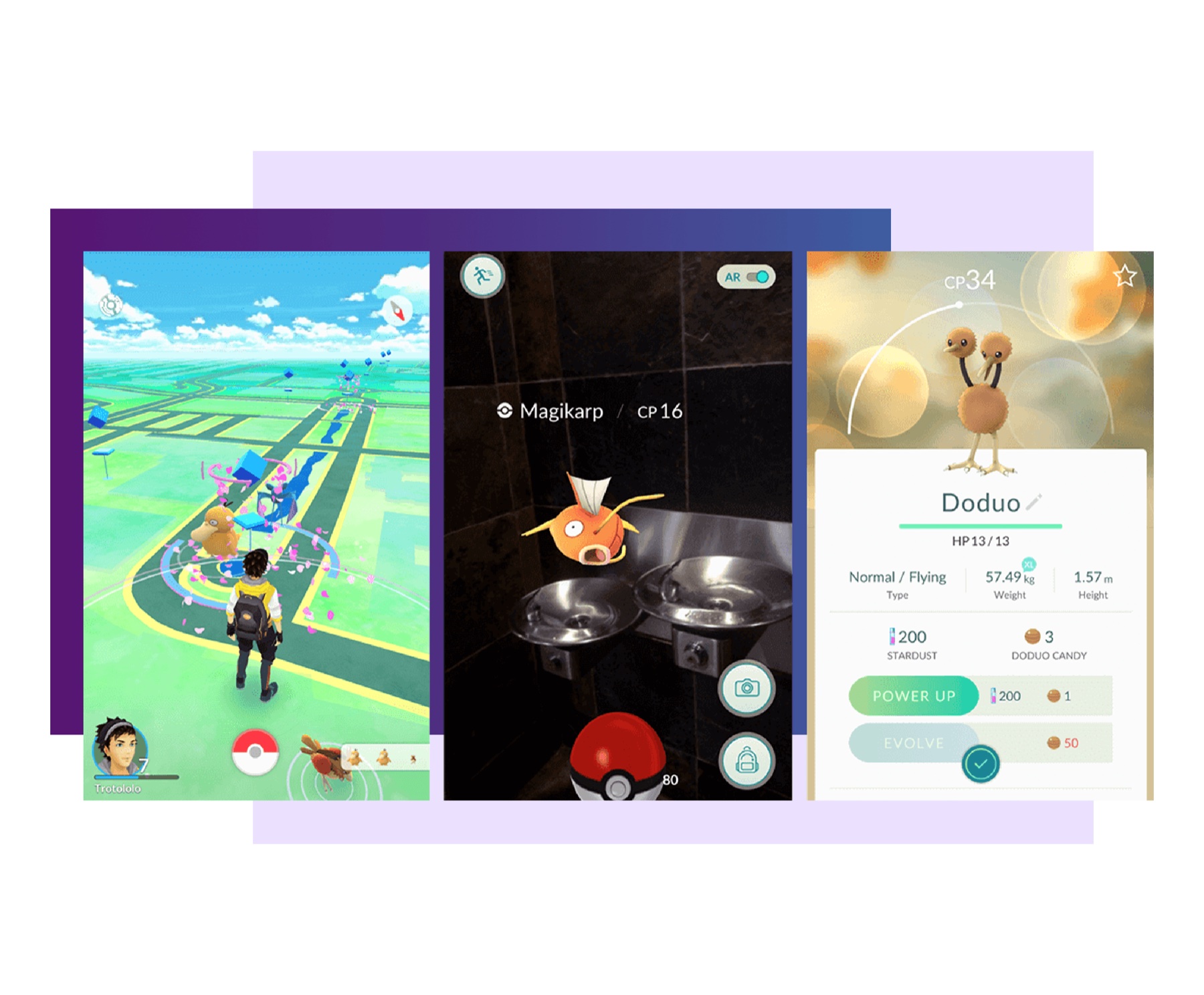
Pokemon GO
Demonstrated how anchoring digital rewards to real-world monuments drives organic foot traffic and encourages users to step outside familiar comfort zones.
Figure 2: Four foundational interaction exemplars analyzed during initial concept synthesis.
Affinity mapping and system architecture ideation
Synthesizing our research findings, the team mapped hundreds of ideas on physical whiteboards and digital affinity boards. We focused heavily on the handoff between the public kiosk, the mobile phone in hand, and the physical keepsake carried away by the user.
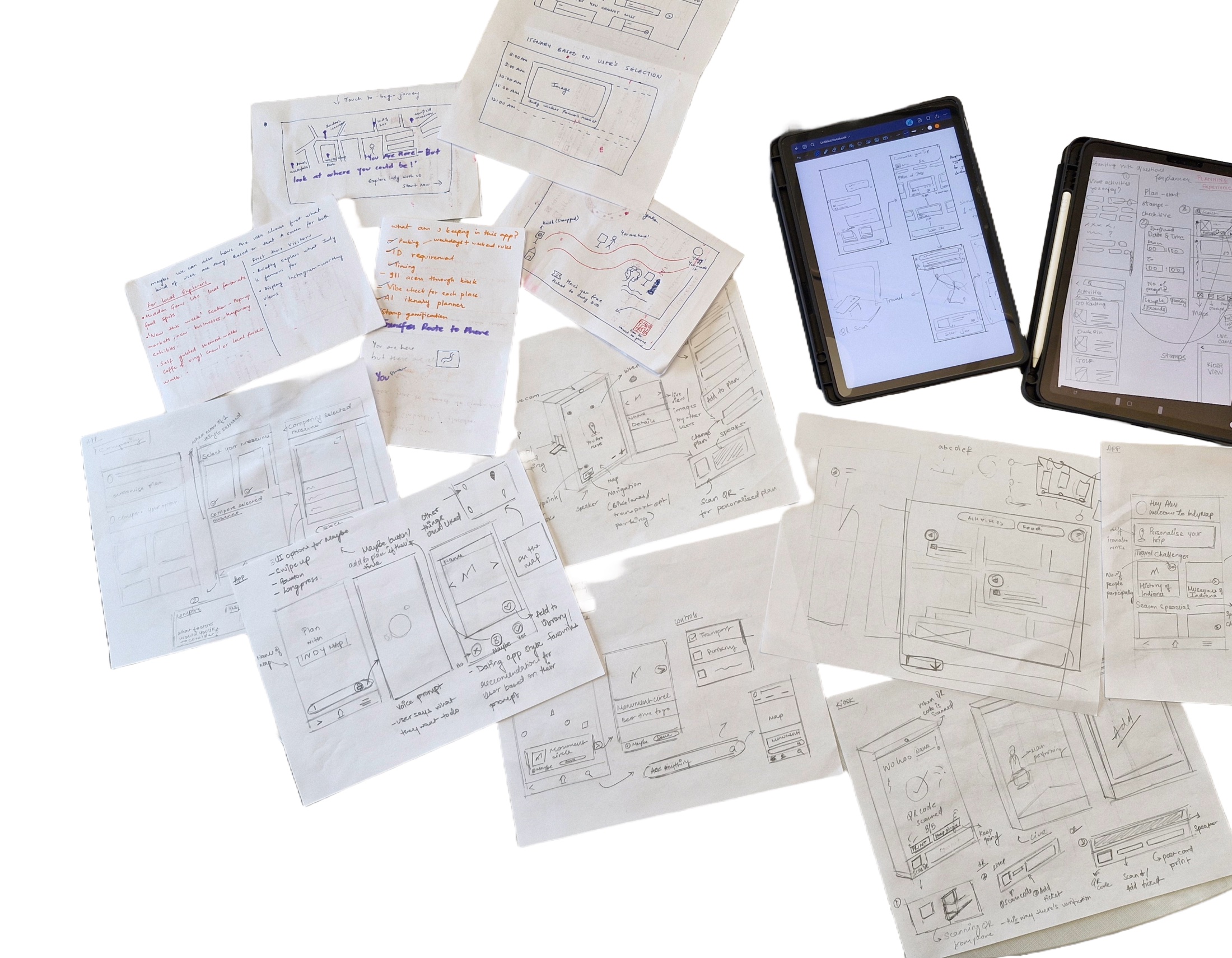
Figure 3: Collaborative affinity clustering exploring kiosk architecture and rewards systems.
Designing for three distinct explorer mentalities
Our user research identified three core personas with divergent motivations, temporal constraints, and navigation tolerances. Designing for all three required a flexible itinerary builder that could adapt whether someone had two free hours on a Saturday afternoon or an entire weekend.

Figure 4: Primary user archetypes mapped to specific exploration motivations and constraints.
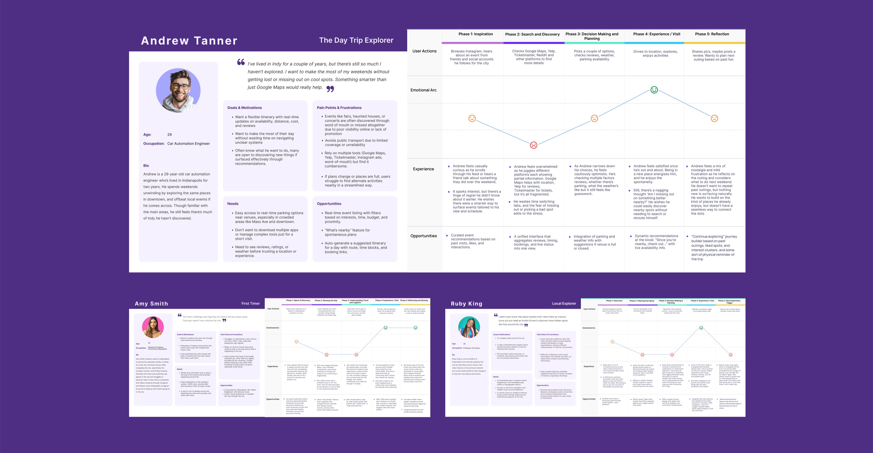
Figure 5: Detailed journey maps capturing emotional highs and lows across city waypoints.
The Local Explorer
Living in Indianapolis for 1 to 3 years. Bored of visiting the same spots, seeking hidden murals, indie bookshops, and uncrowded nature trails.
The Daytrip Traveler
Visiting for a conference or weekend sporting event. Needs curated 3-to-4 hour adventure loops with tight schedule reliability and zero navigation stress.
The New IU Student
Freshly arrived on campus from out of state. Intimidated by the broader city, seeking safe, friendly ways to socialize and connect with classmates.
Why we stopped building a GPS engine and embraced Google Maps
Early in our design phase, our wireframes included a custom in-app turn-by-turn routing engine. But when we tested paper prototypes with students driving through Indianapolis, an obvious truth emerged: nobody wants to navigate unfamiliar multi-lane highways or downtown one-way streets using an unproven student project's map engine.
Offloading Navigation to Google Maps Deep Links
We made the bold decision to cut proprietary turn-by-turn routing entirely. Instead, when a user selects a quest or customizes their checkpoints, IndyQuest compiles the coordinates and launches them directly into Google Maps with a single tap.
This single pivot dramatically simplified our user interface, eliminated driver distraction, and freed our product to concentrate 100% on what actually makes IndyQuest magical: thematic quests, limestone kiosk check-ins, local merchant collaborations, and physical collectible postcards.
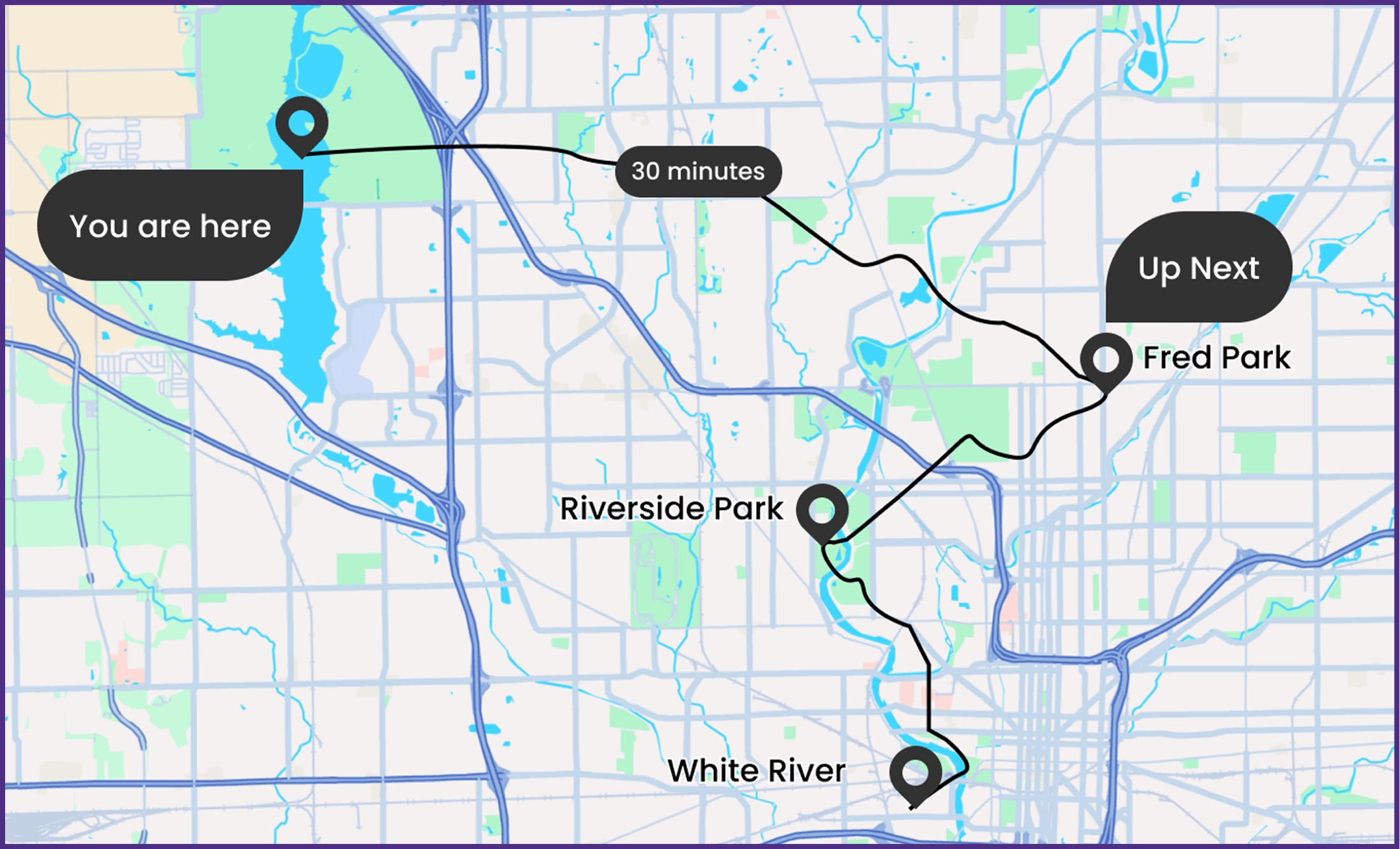
Figure 6: Seamless multi-modal route architecture connecting geographically separated park checkpoints.
Bridging digital quests with physical keepsakes
Most gamified city apps award virtual badges that sit forgotten inside a phone profile. IndyQuest grounds digital discovery in the tangible world. When an adventurer reaches their first checkpoint kiosk, the machine prints a high-quality physical postcard crafted on heavy recycled cardstock.
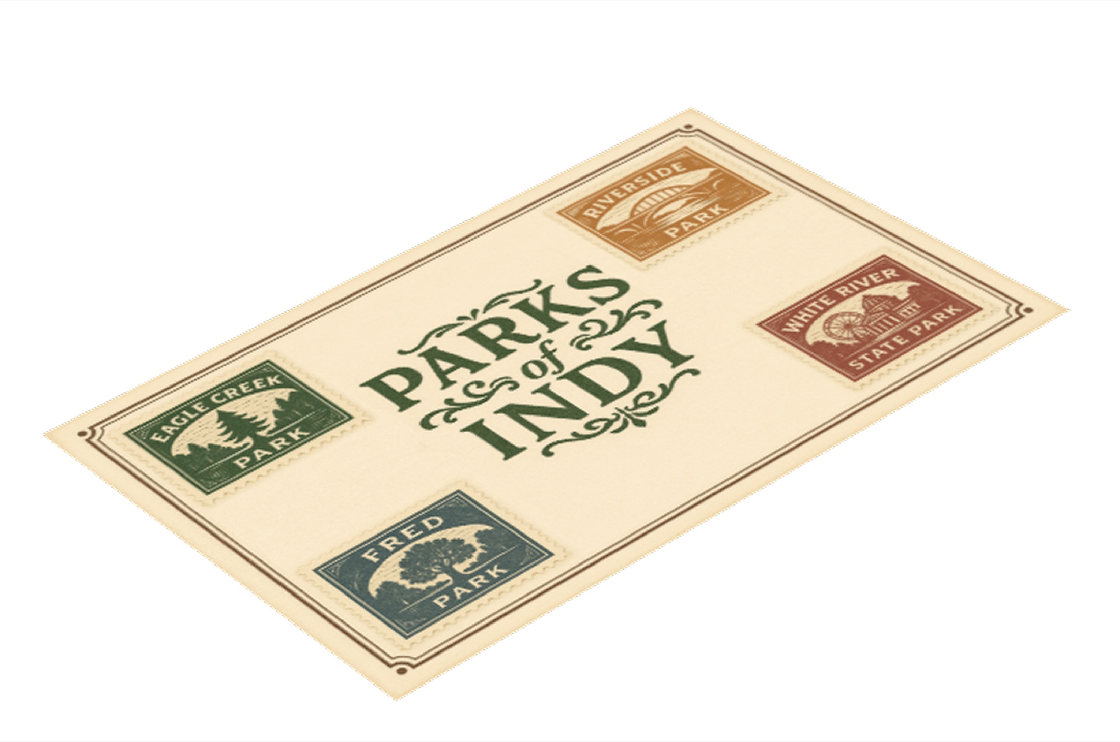
Figure 7: Physical postcard keepsake featuring vintage embossed checkpoint stamps.
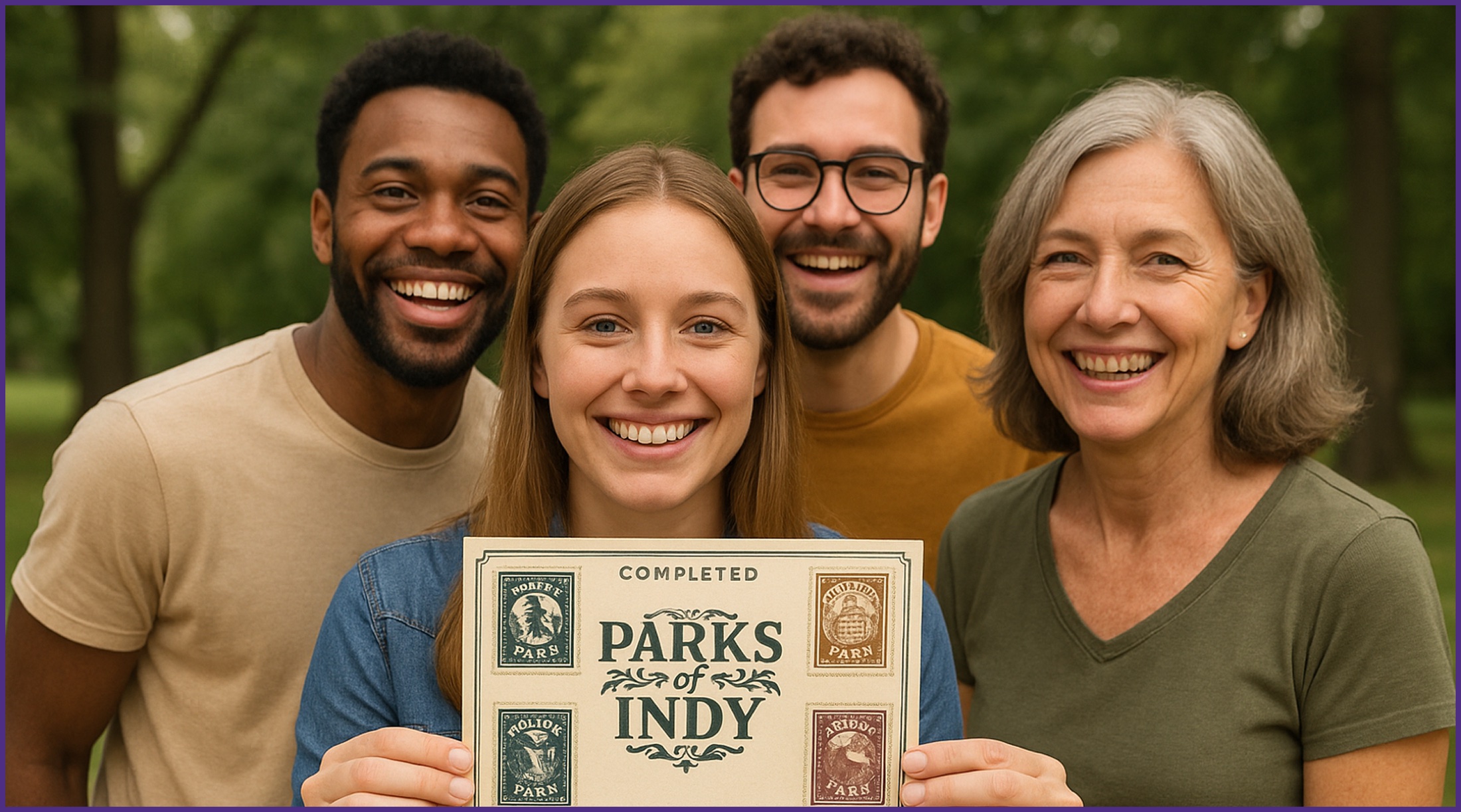
Figure 8: Shared accomplishment: Explorers holding their completed stamped keepsake.
Local Commerce Integration: Merchant Signatures
On the back of each postcard, dedicated signature boxes encourage explorers to visit nearby local establishments (e.g. Lilly Lake Restaurant, Books & Brews, Oakwood Cafe). By showing their postcard to the cashier, visitors receive a signature and a 10% student discount, directly pumping foot traffic into local independent businesses.
End-to-end information architecture
The ecosystem bridges two distinct touchpoints: the public limestone kiosk in public plazas and the personal smartphone in the explorer's pocket. The architecture maps how users discover quests, customize waypoints, check in via QR scanning, print postcards, navigate with Google Maps, and redeem merchant rewards.
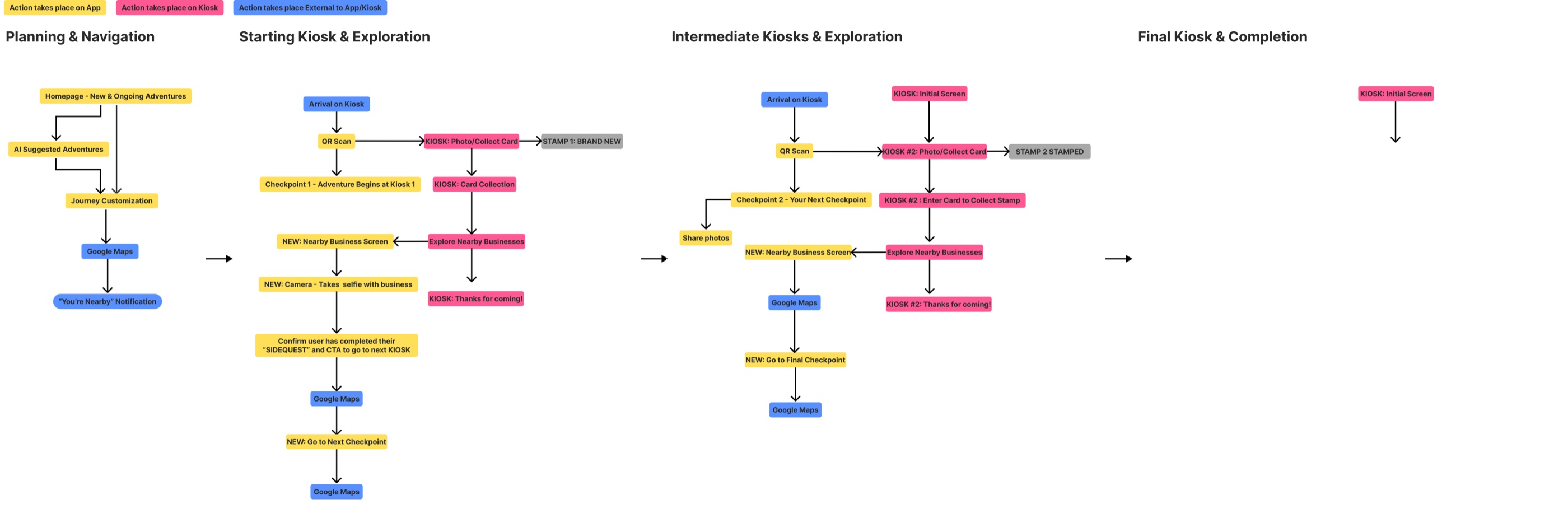
Figure 9: Comprehensive information architecture detailing multi-modal user journeys.
From low-fidelity paper sketches to mid-fidelity wireframes
We moved rapidly through multiple rounds of fidelity: sketching paper UI components to test physical-digital transitions, followed by extensive mid-fidelity wireframe flows in Figma to refine touchscreen ergonomics, button hierarchy, and QR code handshakes.
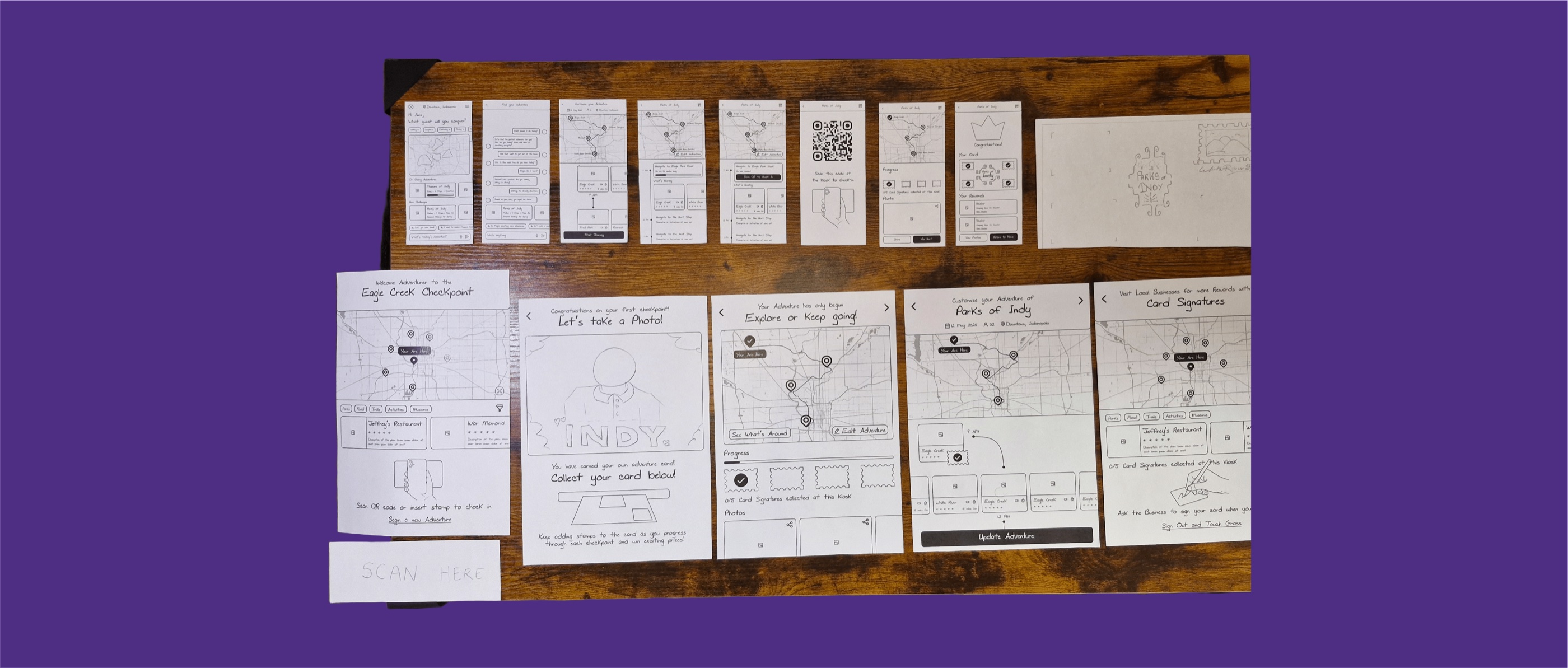
Figure 10: Low-fidelity paper prototypes testing kiosk screens, mobile sync, and physical card slots.
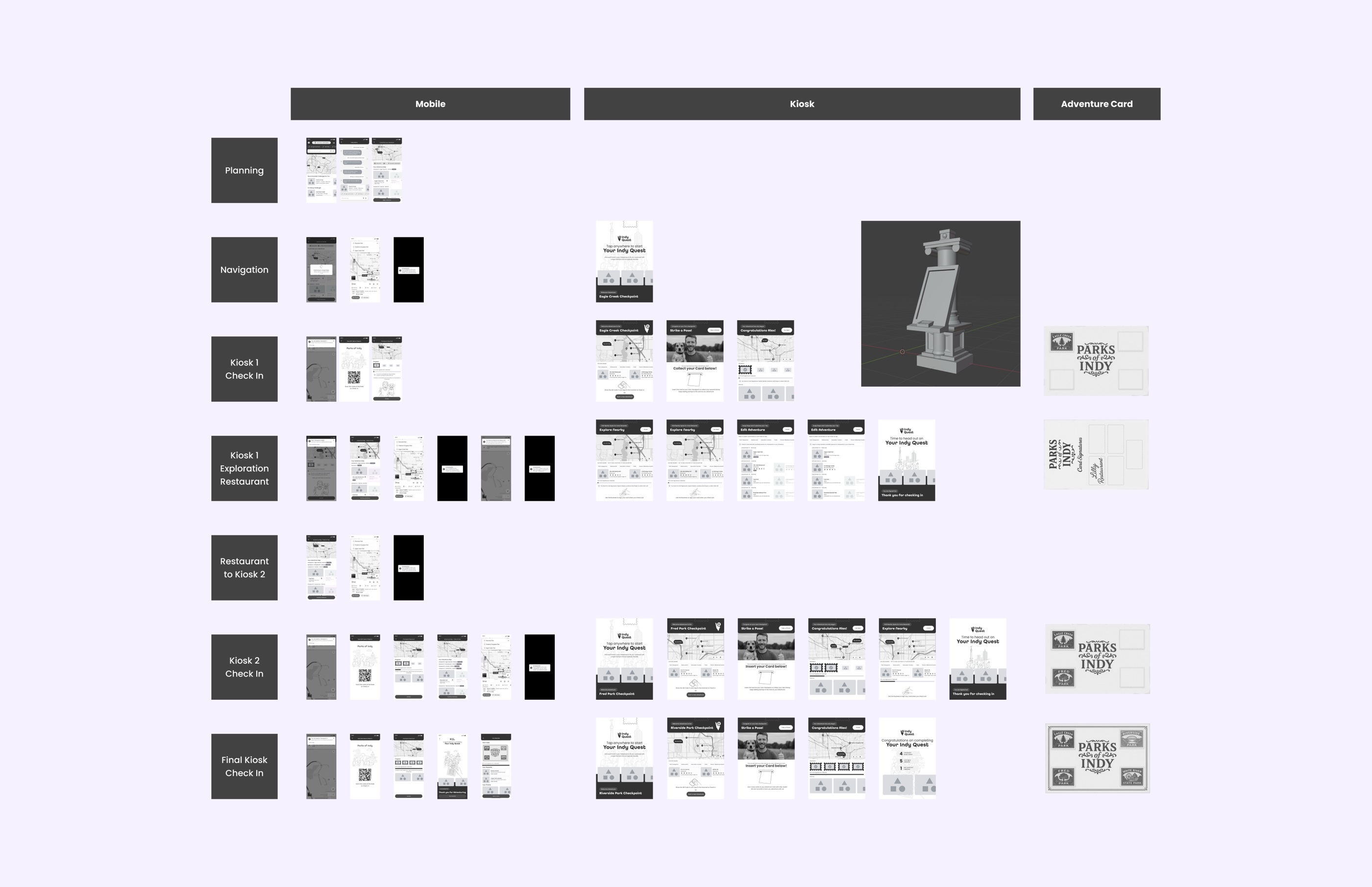
Figure 11: Mid-fidelity wireframe system verifying interaction flows, layout states, and error handling.
Hands-on classroom testing & evaluation results
We conducted think-aloud evaluation sessions with participants at Indiana University, testing paper prototype mockups of the kiosk interface, physical postcard stamping slots, and smartphone screens. Participants simulated completing an adventure across three checkpoints.

Figure 12: Usability evaluation sessions with students testing physical-digital card interactions.
User Satisfaction
High praise for hybrid physical stamping loop and tactile postcard souvenir.
Academic Score
Evaluated by IU HCI faculty for adapting wayfinding to realistic urban constraints.
QR Check-in Time
Seamless mobile QR scan handoff without requiring tedious account sign-ups.
High-Fidelity Interface & Interactive Features
Explore the complete end-to-end user experience below. The carousel automatically advances every 2 seconds, pauses on hover, and allows manual control using arrows, dots, or keyboard navigation. Click any image to view full screen.
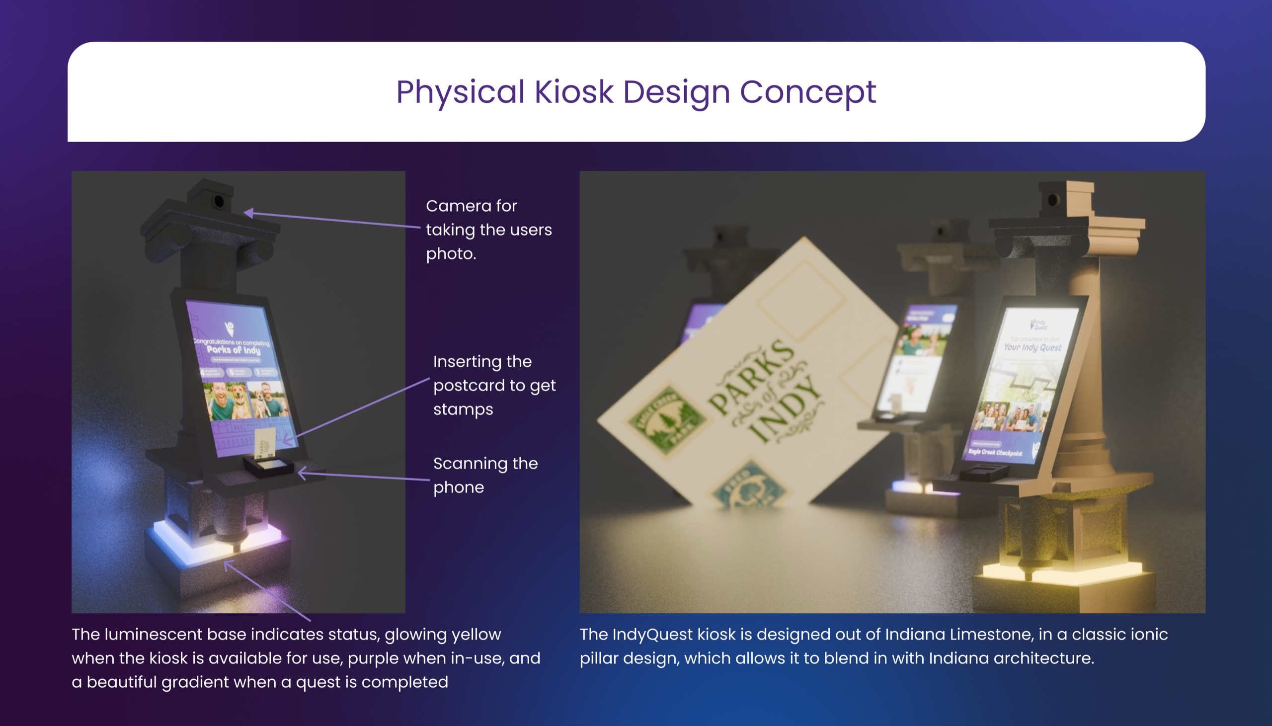
Physical Kiosk Concept
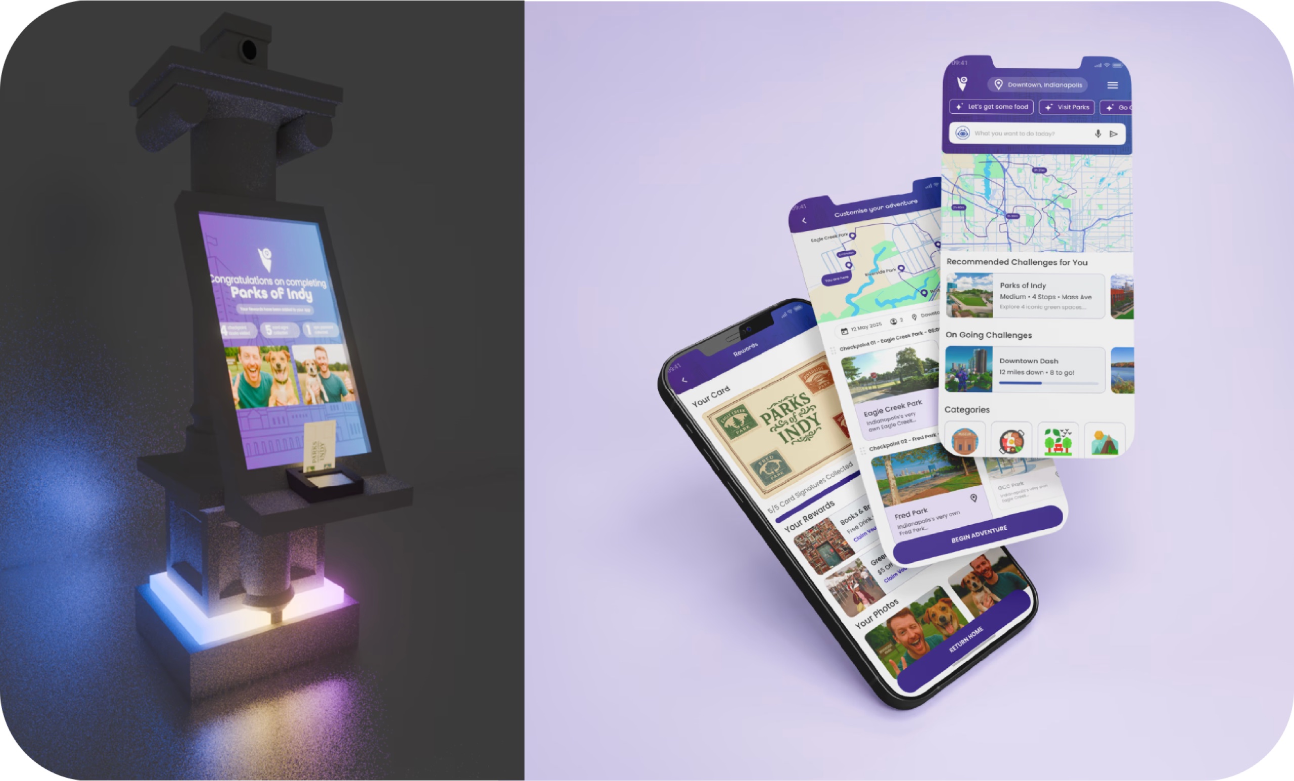
Crafted out of iconic Indiana Limestone in an ionic pillar design to blend with civic architecture. Features an integrated camera, touch screen, phone scanner, postcard stamping slot, and a glowing status base.
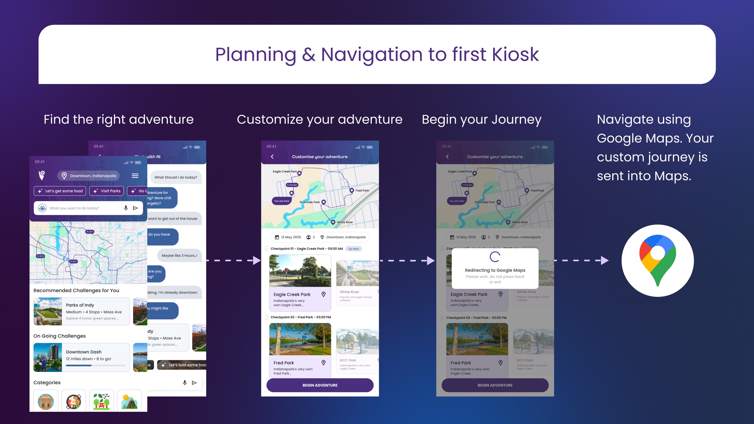
Planning & Navigation
Select an adventure theme using conversational AI prompts or curated categories. Custom checkpoints can be reordered, and tapping Begin Journey instantly routes the multi-stop trip inside Google Maps.
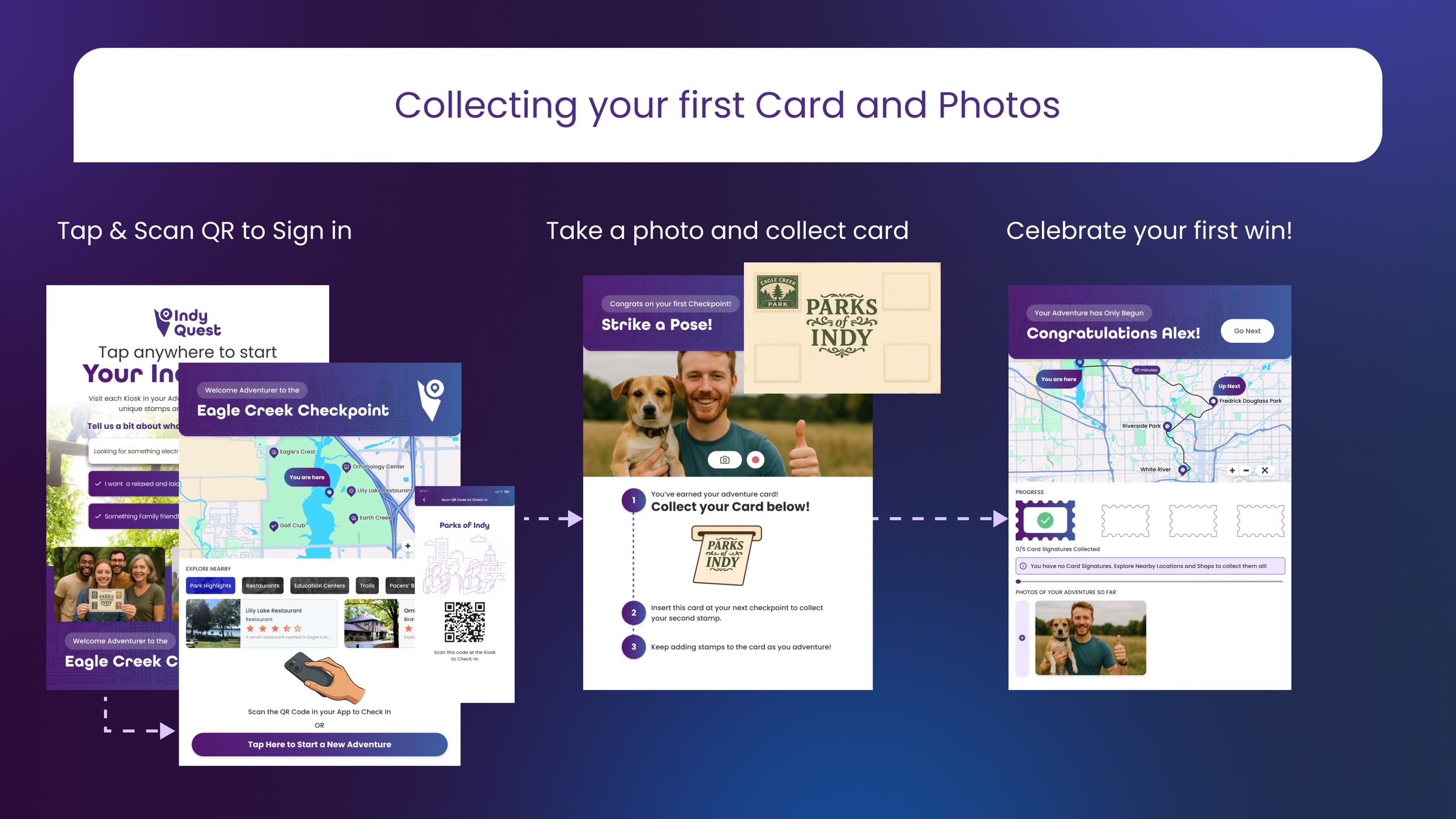
Postcard & Photo Checkpoint
At the first kiosk, scan the QR code to check in, snap a group selfie, and collect your physical keepsake postcard with the first checkpoint stamp already embossed.
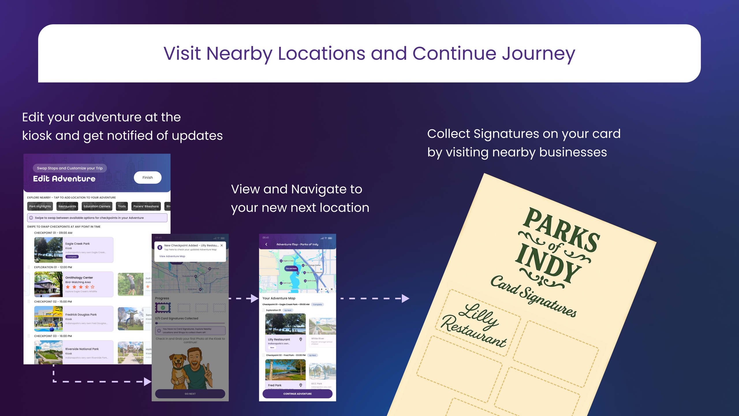
Merchant Signatures & Flexibility
Swap upcoming stops dynamically on the fly. Visit partnering local shops and cafes like Lilly Restaurant to collect physical merchant signatures and claim student discount perks.
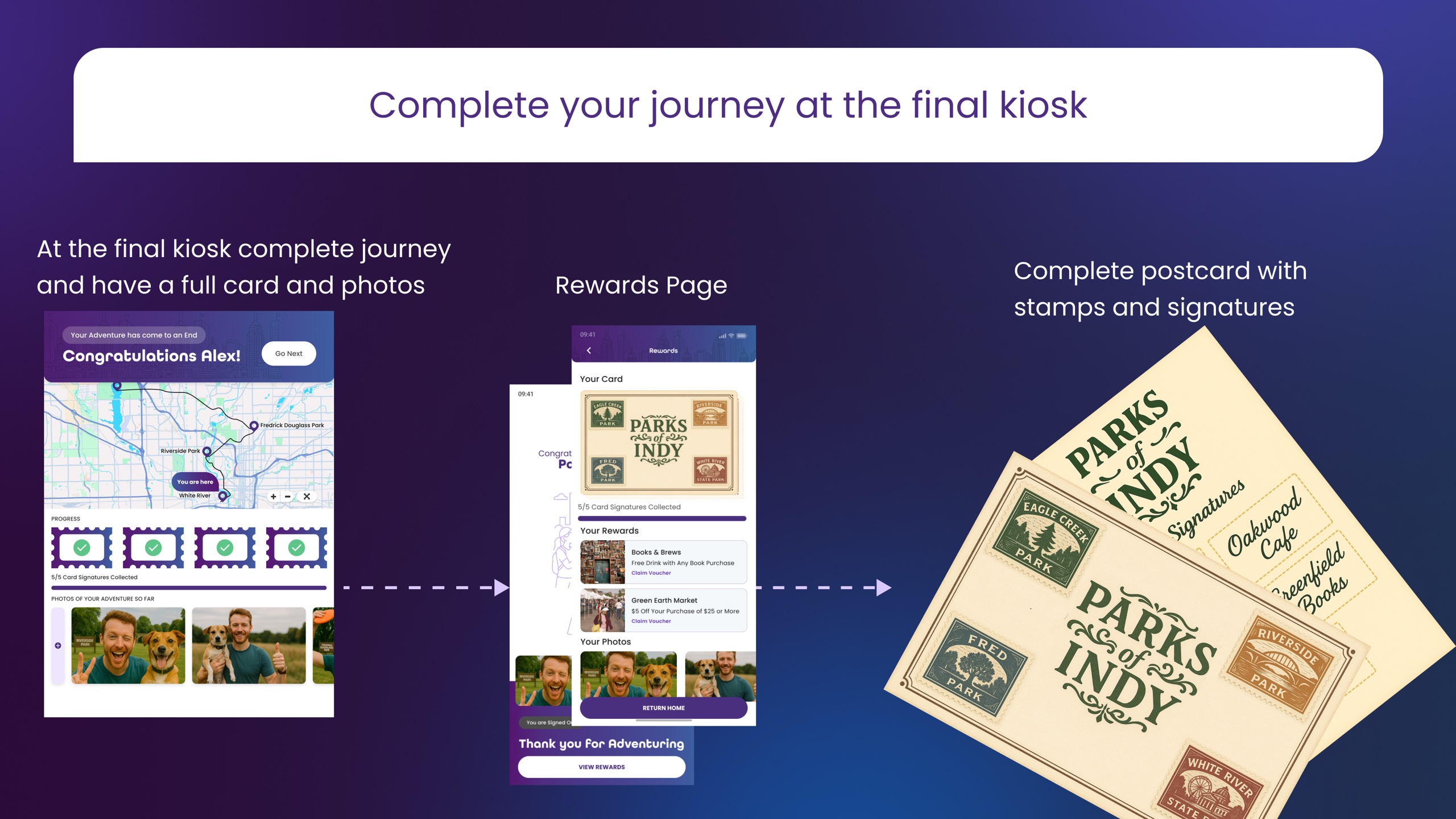
Final Kiosk & Reward Unlocks
Complete the quest at the final kiosk to finish your stamped postcard, unlock local business reward vouchers, and save your photo album of memories.
Team collaboration & project takeaways
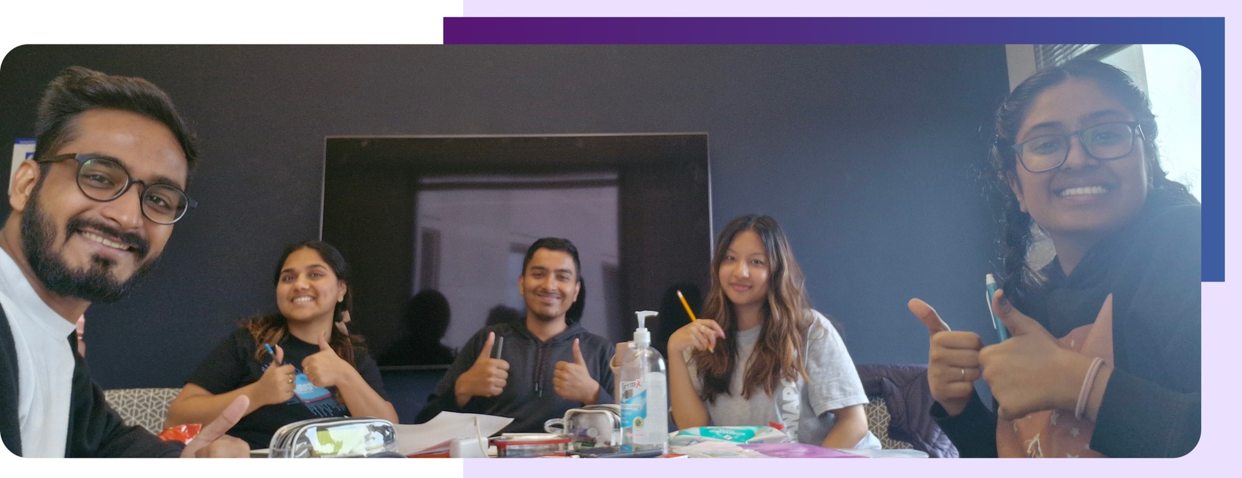
Figure 13: The IndyQuest interaction design team at Indiana University (IUPUI).
Key Takeaways on Spatial Interaction
IndyQuest reinforced the philosophy that the most powerful digital interfaces often work best by knowing when to step back. In urban design, forcing users into closed ecosystems or reinventing turn-by-turn navigation creates frustration rather than delight.
By integrating familiar tools like Google Maps and elevating physical artifacts like stamped postcards, we bridged the gap between digital convenience and real-world civic joy.